FREE eDM & SMS Reporting Dashboard in SFMC
Marketing Cloud’s native reporting is fine for a quick check, but it doesn’t really give you what most teams actually want: one place to see triggered sends, user-initiated sends, and Journey Builder sends side by side, broken down by day, with trend lines you can actually compare across 30/60/90-day windows — for both email and SMS. So I built one running entirely on SFMC’s own tooling: Data Extensions, SQL Query Activities, an Automation to keep it fresh, and a CloudPage to render it.
And since none of it depends on anything outside SFMC itself: no external hosting, no third-party service, no license. I’m sharing the whole thing. Grab the package, import it into your own Business Unit, and you’ve got the dashboard running in an afternoon.
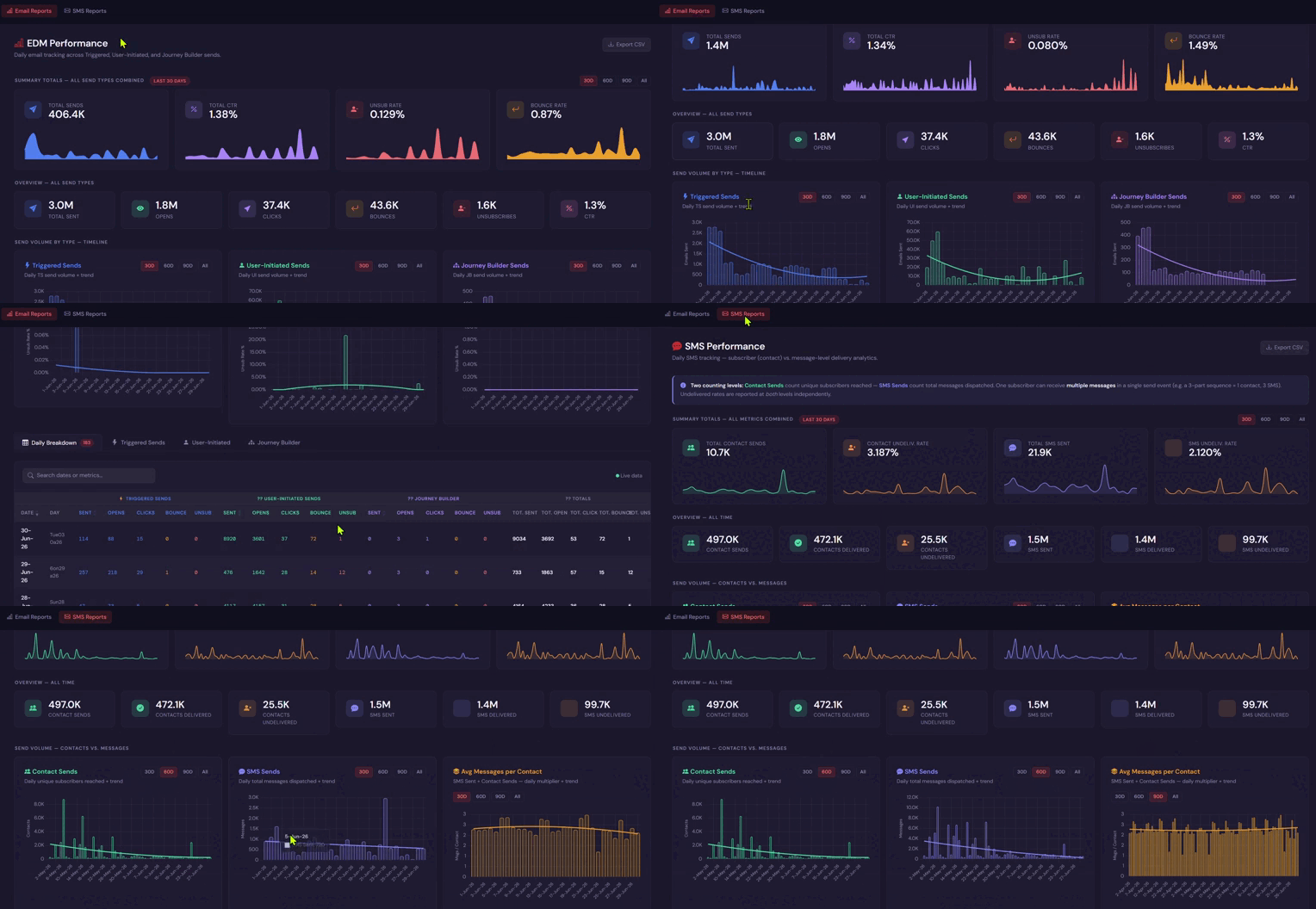
Here’s how the pieces fit together, and what the finished dashboard actually looks like.
The shape of the problem
Email performance in SFMC comes from three different worlds that don’t naturally sit next to each other in the UI:
- Triggered Sends — transactional-style, event-driven emails
- User-Initiated Sends — one-off sends someone kicked off manually
- Journey Builder Sends — anything flowing through a journey
Add SMS on top, and you’ve got a second channel with its own quirks. Most importantly, that “sends” means something different depending on whether you’re counting unique contacts reached or total messages dispatched (a 3-part SMS sequence to one person is 1 contact, 3 messages — and undeliverable rates need to be read at both levels independently, or they’re misleading).
None of that is hard to model, but it doesn’t fit into a single Discover report or a stock SFMC dashboard. So the plan was: land the data in Data Extensions shaped the way I actually want to report on it, keep it current with a scheduled Automation, and build the front end as a CloudPage.
The data layer: Data Extensions + SQL Query Activities
The reporting DEs are populated by SQL Query Activities pulling from the standard SFMC tracking/sendlog data — grouped and aggregated by day and by send type, rather than left at the raw event level. A few design choices that made the front end much simpler later:
- Pre-aggregate by day. The dashboard’s charts are all daily timelines (sends, opens, clicks, bounces, unsubscribes, CTR), so the query does the
GROUP BYwork once on a schedule rather than the CloudPage doing it live on every page load. That keeps the page fast regardless of how much historical data has piled up. - Split by send type at the query level, not in the presentation layer — Triggered, User-Initiated, and Journey Builder each get their own row per day, plus a combined total. That’s what lets the dashboard show three independent send-volume charts next to each other and a “totals” column that just sums them, instead of re-deriving the split every time the page renders.
- SMS gets a parallel but separate structure — contact-level sends (unique subscribers reached) and message-level sends (total SMS dispatched) are tracked as distinct metrics in the same row, since collapsing them into one number loses exactly the distinction that matters for reading undelivered rates correctly.
Keeping it current: the Automation
A scheduled Automation runs the Query Activities on a daily cadence, refreshing the reporting DEs before anyone opens the dashboard. This is the piece that makes “Live data” (there’s a status indicator for exactly this in the daily breakdown table) a meaningful claim rather than a decorative label — the CloudPage itself never queries send logs directly; it only ever reads from the pre-aggregated DEs, so the Automation is the one place responsible for freshness.
The front end: a CloudPage, not a Discover report
The dashboard itself is a single CloudPage with two tabs — Email Reports and SMS Reports — built the same way as everything else in this series: SSJS on the server side to pull data out of the reporting DEs, rendered into a JS charting layer on the client side for the actual graphs.
Email Reports leads with four summary cards — Total Sends, Total CTR, Unsub Rate, Bounce Rate — each with its own small trend sparkline, and a toggle between 30/60/90-day and all-time windows that updates every chart on the page at once. Below that, an all-send-types overview strip (Total Sent, Opens, Clicks, Bounces, Unsubscribes, CTR), then three matched pairs of charts — send volume and CTR — one pair each for Triggered, User-Initiated, and Journey Builder sends, so you can visually compare how the three channels are trending against each other rather than hunting through three separate reports.
Underneath the charts sits a full daily breakdown table — sends, opens, clicks, bounces, and unsubscribes for each send type, plus running totals, one row per day — with a search box to filter by date or metric, and an Export CSV button for anyone who wants the raw numbers in a spreadsheet instead of a chart.
SMS Reports follows the same layout pattern, but leads with an explicit callout explaining the two counting levels (contacts vs. messages) before showing any numbers — worth doing deliberately, since it’s the one thing about SMS reporting that trips people up if it isn’t stated up front. From there it’s the same shape as the email tab: summary cards with sparklines, an all-time overview strip, and paired volume charts — Contact Sends, SMS Sends, and Avg Messages per Contact — each with the same 30/60/90/All toggle.
Why a CloudPage instead of native SFMC reporting
A few reasons this ended up being worth building rather than living with Discover reports:
- Cross-channel-type comparison in one view. Native reporting treats Triggered, User-Initiated, and Journey Builder sends as separate reporting contexts. Here they’re three panels on one screen, on the same time axis, so a dip in Journey Builder volume is visible right next to whether Triggered sends picked up the slack.
- Consistent time-window toggles everywhere. Every chart on the page responds to the same 30D/60D/90D/All pattern, so you’re never comparing a 30-day chart against a 90-day chart by accident.
- It’s just a Data Extension underneath. Anyone who wants the numbers outside the dashboard — for a deck, for a different report, for another automation — can query the same reporting DEs directly instead of re-deriving the aggregation logic somewhere else.
- CloudPages are free real estate. No extra tooling, no external hosting, no new login system beyond what the account already has access to — it’s SSJS and a Data Extension, the same building blocks as everything else covered on this blog.
Where this could go next
A few natural extensions, if I keep building this out:
- Per-send drill-down. Click a row in the daily table and land on the performance of that specific send, rather than only the daily rollup.
- Alerting off the same DEs. Since bounce rate and unsub rate are already tracked daily, a simple threshold check in the same Automation could flag a send that’s underperforming before someone has to notice it manually on the dashboard.
- Content/template performance. Since sends are already tracked in the reporting DEs, joining that data against the asset IDs from the Content Builder API posts would let you answer eDM actually perform best, not just “how did this campaign do” — turning the reporting layer and the automation layer into one connected system instead of two separate projects.
None of those need a different architecture — just more Query Activities feeding more panels onto the same CloudPage.
How to install it on SFMC
- Download the package file.
- Login to SFMC and go to Package Manager.
- Upload the file and deploy it.
- Go to Automation Studio and find the automation under “Tracking and Monitoring” folder.
- Run the automation manually.
- Schedule the automation to run daily.
- Go to CloudPages and publish the cloudpages under “Tracking and Monitoring” folder.
- Open the URLs of the published pages in your web browser.